The UW PM graphic design system was created to guide graphic designers and provide a library of commonly used assets and layouts to maintain consistency across graphic design initiatives. The library developed kept in mind the posts that would be seen throughout social media platforms and was created to form the foundation for what these posts should look like.
Graphic Design Layouts
To initiate this design system, the team first made a list of all the potential layouts of designs that would be needed across marketing efforts.
- Facebook banners
- Physical posters
- Eventbrite banners
- Google form banners
The list gave the starting point for the layouts we would need to create. The team then went through previous designs while doing research into commonly used layouts across marketing initiatives seen in larger corporations.
From experimentation, the layouts were created based on a column system with gutters and margins.
The team created this guideline as a starting point for designers but understand that this is flexible to change. The purpose was to have some sort of layout that new designers could start from to create a level of consistency across designs.
The layouts were integrated into the UW PM’s Figma design library to be used across all design files.
Graphic Design Assets
The design team at UW PM also wanted to create a greater sense of identity for the club and as such, efforts were made into creating custom assets.
The purpose was to create UW PM’s own library of designs assets so that when there was a need for designs to be created, designers could reference a consistent library of UW PM designs to use with ease. This effort was a long term and ongoing process that took place over the course of the 2 terms. We wanted to encapsulate assets that were versatile yet spoke to the UW PM brand. As such, graphics such as computer mice, the UW PM hexagon pattern, little monster creatures, files, and other assets were made.
This graphic design library was created and integrated with Figma’s features such as using variants and aligning these variants with our colour scheme.
Templates
The team also identified a need for templates, posts that were used commonly from term to term. Creating templates for these posts would allow for designs to be created quickly while still being consistent. We started by creating a template for the Instagram takeovers. Having this collection started here means that future terms can simply copy and paste and replace the necessary information on these templates for posts to be created in minutes compared to before, where designers were recreating assets from scratch each time a request came in.
UnDraw Illustrations
There were also times when requests came in from the marketing team where we realized that the creation of the custom assets could not be created to keep up with the demand. We needed designs completed quickly so we turned to third-party resources like unDraw. The team came up with the idea to have a library of undraw illustrations that could be used for when custom assets did not meet the needs of the marketing requests and as such, a library of unDraw illustrations were created based on our colour scheme.
The purpose for establishing a branding guideline for the UW PM design team was to create a sense of unity and brand identity for UW PM. Having a branding guideline would provide a foundation for designers to reference for consistency and establish what it means for a design to be on brand.
First, the team brainstormed what are the required elements of the branding guidelines as:
- UW PM brand values and description
- Logo assets and usage
- Font styles
- Colour palettes
UW PM's Brand
To start this off, we needed to establish UW PM’s brand values. Several discussions were organized with the UW PM core team and the following were established.
Logo Assets & Usage
The team established 5 standardized sizes for the UW PM logo to maintain consistency for designers.
Logo Size
Sample Marketing Usage
Sample Product Usage
640 x 640px
Individual logo posts
Desktop landing page
420 x 420px
Individual logo post
Desktop landing page
250 x 250px
Banner décor
Mobile loading page
200 x 200px
Instagram post(s) décor
Poster décor
Navigation décor
100 x 100px
These sizes were selected based on the current logo usage throughout current designs. The variation in sizes would give designers enough flexibility to select the appropriate size for their designs while still aligning with the definition of pre-defined sizes in the branding guideline.
The team also defined 3 colours for the logo to be used. The selection of using the main UW PM colour was for establishing the brand identity as that is the core colour of the UW PM brand. The selections of black and white were made for versatility and flexibility as black and white easily compliment a variety of colour and designs. The hope is that by establishing these foundational variations of the logo, this will maintain consistency and flexibility for future designers to base their designs with these assets in our library.
Typeface Selection
Establishing UW PM’s font styles was an interesting problem to tackle as there was no standard to use from before documented or preserved. The team needed to do research into font styles and how they would be leveraged to communicate the UW PM brand identity.
Initial Research
We started the process off with experimentation, taking a look at other brands and companies to see what sorts of font styles they implemented. The team was assigned to come up with some variations and report their findings and thoughts on them; trying out font choices on previous designs and assessing which resonated with our brand. We formulated some requirements of our font selection from this experimentation. The selected font should:
Reflect innovation and creativity with a modern aesthetic.
These words resonate with UW PM’s belief of the product management field as a new, emerging, and innovative career path.
Possess a reasonable level of font styles and variations.
A font with variations of thickness, slants, and widths, would make a good selection as this gives the font flexibility and variability to be used for multiple applications on the design team.
Be open-source.
To be financially responsible and reduce the cost burden on the team, the font selected should be free to use and open source under its respective license.
Serif or Sans Serif?
A critical question brought up during this process was whether we should select a serif or sans serif font. From our discussion, the following key points were mentioned regarding this idea:
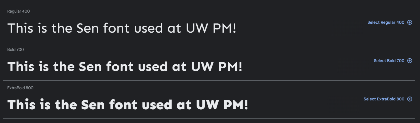
The current logo uses the sans-serif Sen font.
It would be a good idea to maintain this font for consistency and continuity of our brand.
Sans-serif fonts are typically used for digital applications.
UW PM’s initiatives are digital in nature. Most marketing and product efforts will be viewed digitally; it may be beneficial to leverage a sans-serif font.
Productive fonts and expressive fonts serve different purposes.
Considerations should be made regarding HOW fonts are used. Productive fonts used on the website need to be readable and accessible, versus fonts that focus more on marketing should be more eye catching and expressive.
To address these key ideas, the team did some research and had the idea to use a combination of serif AND a sans-serif font for UW PM designs. The idea here is that this would give flexibility for the font choices to fit the needs of both marketing and product needs, depending where the designer see fit. We also observed that the Sen font used in our logo only had 3 styles.
As such, this limitation meant that our second font choice should introduce some more variability so that we can create visual hierarchy in our designs. Given that Sen is a sans-serif font, the team did some experimentation and settled on the
Bitter font, a serif typeface under the
Open Font License agreement with over 10+ font styles.
Typeface Design
Settling on the Sen and Bitter fonts, we wanted to create a guideline that defined the sizing and usage of the fonts.
For sizing, we wanted to leverage popular frameworks that have already been established. As such, our starting point was to leverage the
Material Design Type System that does a wonderful job of laying out the hierarchy of fonts and how they should be styled. Sizes and usage was defined based on this system and this set the styles seen in the branding guidelines.
Another consideration made was that since the Sen font has less font variation than that of the Bitter font, large headlines should utilize the Bitter font to create visual hierarchy. As such, the semi-bold style was selected as the default for Bitter headlines. Knowing that there are more variations for this font, setting a standard is still a good idea to establish the boundaries of the brand, while still allowing for designers to go in and update variations as needed and continue to be creative.
Implementation & Documentation
To implement and document styles, Figma’s design library features were used to create styles that could easily be accessed throughout designs to optimize design efficiencies.
Colour Palette
Establishing a colour palette for the UW PM brand was another core branding component that was important to create. Based on previous branding work, we knew that we needed to keep the original UW PM colour along with black and white. However, we needed some other colours to compliment the core colours and give the brand some more life and variation. Since this was the first variation, we started with selecting a few at a time to ensure that the brand is not too diluted, but as the term progressed, we slowly introduced more and more colours so that future designers were not limited by the small number of brand colours and could be given creative freedom.
Primary colours were selected to resemble tones of the main UW PM colour to give some more depth into the selections.Secondary colours were selected to compliment the warmer tone of the main UW PM colours, including a blue and some yellow tones.
These were experimented on within marketing posts and as such, we observed reoccurring colours that the team liked to use and continued to develop the palette for the UW PM design team. The ongoing process of adding colours would slowly create a palette that could maintain consistency between designers while still allowing for creative freedom.


